
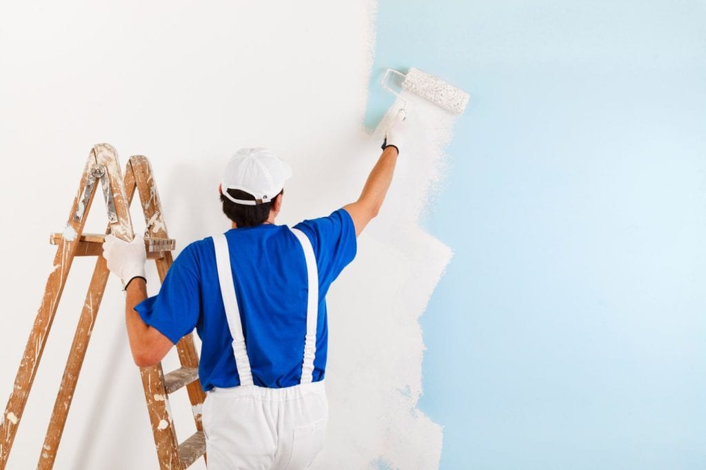
Paint is one of my all-time favorite ways to update a space quickly and easily. It just changes the way a room feels instantly. But paint can be very overwhelming to most people. I learned a ton about paint when I worked for Sherwin-Williams as a color consultant. It was like a master class in paint. I learned how a quality paint product makes a world of difference.
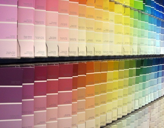
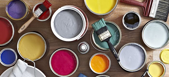
Now, what should you know when you start a paint project? First thing is color. Choosing a color is the most difficult part. This is why I stayed so busy when I worked for them and is also still part of every design I do. Color sets the mood. And every color does have a psychological aspect to it. (Maybe that’s for a future post. Stay tuned!) A great way to find out what colors you are drawn to, is to simply start paying attention to the world around you. Maybe you love the colors in your best friend’s kitchen? Or you saw an image on Pinterest that you loved? Which, by the way, Pinterest is a great place to get ideas. Once you determine what you like, you need to narrow down what will work in your home. Let’s say you’re loving grays. Well, you’re right there with most people. But grays are very tricky. They change tone in every room and time of day. I love Sherwin-Williams Agreeable Gray and Benjamin Moore’s Revere Pewter. But wow, do they change dramatically from home to home. I’ve seen both these colors go from a tan to a cool gray within the same home. Here’s where a designer can help you make the correct choice! As well as help with your expectations. I always tell people to go buy a sample of the colors you like. Then buy some poster board. Paint the shiny side and tape it up with painters’ tape. Look at it in the morning, afternoon, and at night. Look at it on a sunny day and a cloudy one. No matter what you choose, it will change color when different lights hit it. This is the nature of the beast and there’s no way around it. Color is determined by light reflection. Science, my friends! So, we just have to prepare ourselves for it. Some colors have a more dramatic change throughout the day than others. So why poster board? Can’t I just paint on my wall? No! This is where people run into problems. Unless your walls are white, don’t do it! The sample paints are thin. They have none of the added properties that make a quality paint cover so nicely, so the current wall color will show through and affect how you see the sample paint. Also, the color surrounding that spot you painted will affect it too. That’s why I like poster board. One big sheet will help keep it true to color.
Now that you have completed the difficult task of narrowing down that perfect color, what do you buy? Or how do you know what to ask your painter? Here’s my quick guide to paint knowledge.
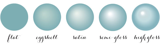
First, sheen. There’s Flat, Matte, Satin (Eggshell), Semi-Gloss, and Gloss.
Flat: I only use flat paint on the ceiling. Period! It flat out sucks for anywhere else. Some people think they want it because “I don’t like shiny paint.” Flat paint can’t be cleaned and can look chalky. Can you tell I hate flat paint? Ha!
Matte: It’s hard to find a cleanable nice matte paint. I like Emerald or Duration from Sherwin for this use. It’s a washable matte. Matte is like a flat, but enough sheen to be washable without being “shinny” or chalky.
Satin/Eggshell: This is the most common used paint. It has the right amount of sheen for my liking. If you buy a quality satin paint, you won’t even notice the sheen. It will look buttery on your wall and will wash nicely. It can be used in a bathroom instead of the commonly used Semi-Gloss. I tend to buy Sherwin-Williams Super Paint or Cashmere.
Semi-Gloss: Most commonly used on trim. It was the recommended for bathroom walls or any walls in a room with a lot of moisture. I only use this on trim. This is usually the sheen people see that can be too shinny. I like Sherwin-Williams ProClassic for this.
Gloss: Typically known as the most durable paint. Cleans up easily. Mainly used on cabinetry. I rarely use a gloss paint. Especially with the quality of cabinet paints on the market. But to each their own.
My go to is usually Flat on Ceilings, Satin on Walls, and Semi-Gloss on the Trim and Cabinetry.
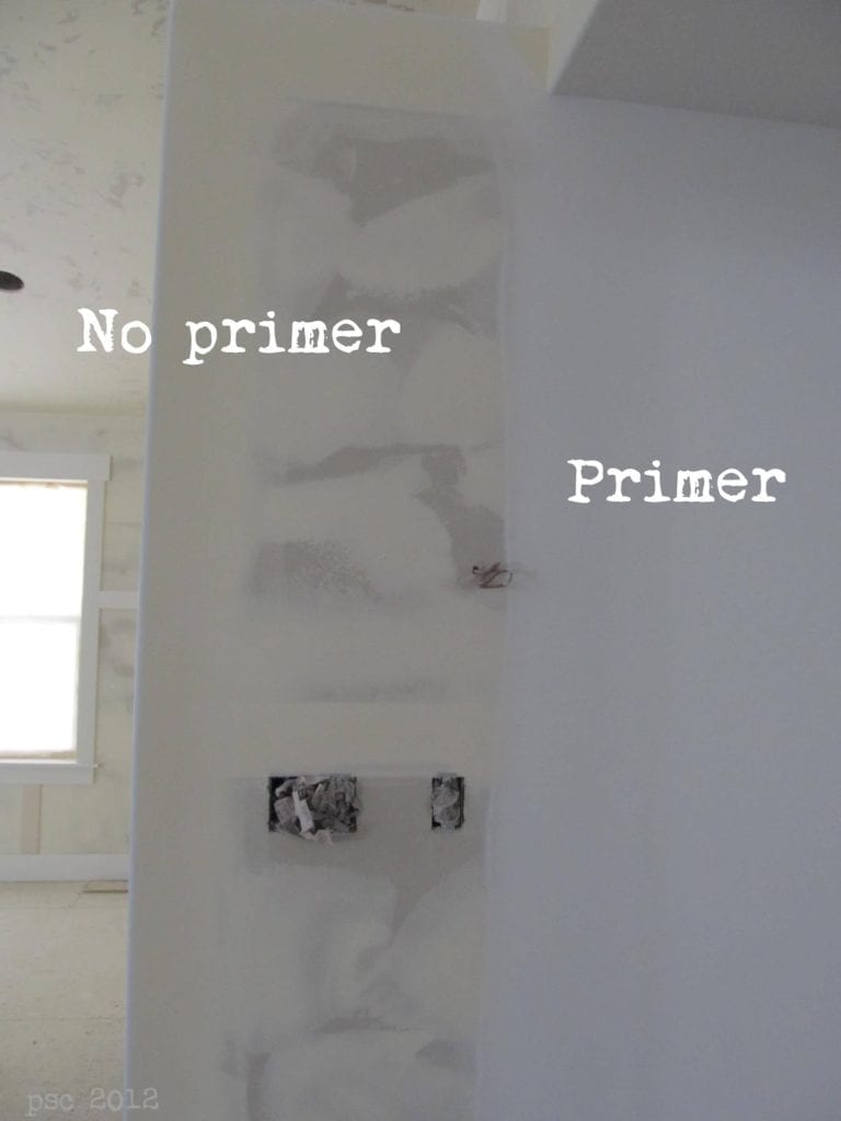
Paint and Primer in one is a gimmick!!! I had a guy get so angry that his paint and primer didn’t work in one coat on his fresh sheetrock. That’s because paint and primer are 2 completely different things. This is an advertising ploy started by a big box store, then adapted around the industry because it sold like crazy. Yes, although the “paint and primer in one” paints are thicker and cover better, it is not a true primer. If you have fresh sheetrock or covering a red painted wall, you better use a primer first or you will use way too many gallons of paint to do what one gallon should have. Primer is super cheap compared to paint, so spend your money more wisely!
If you’re hiring someone to do the work for you, get at least 3 bids and don’t just go for the lowest. A bid that seems too good to be true usually is. These guys use cheap paint and the quality of the work is never great. A good painter will use a quality paint product and will pay attention to detail while applying the paint. It’s worth the extra money for the quality you will receive.
Lastly, if you’re painting yourself, then don’t skimp on your tools. Nothing is better than a quality angled brush. Purdy makes great brushes that won’t shed bristles as you paint. Make sure the roller you use is the right thickness. Thicker for textured walls and thinner for smoother walls. You need that thicker nape to get into the texture of a wall. A thicker roller can cause a messy application of paint to a smooth wall. The staff in a good paint store can guide you to the correct tools for the job.
Then step back, sip a glass or wine (or tea) and enjoy the work you just completed!
Recent Comments